Introduction
The Random Forest algorithm is a tree-based supervised learning algorithm that uses an ensemble of predicitions of many decision trees, either to classify a data point or determine it’s approximate value. This means it can either be used for classification or regression.
When applied for classification, the class of the data point is chosen based on the class that was most voted by the trees; and when applied for regression, the value of the data point is the average of all the values output by the trees.
An important thing to remember when using Random Forests is that the number of trees is a hyperparameter and it will be defined before running the model.
When working in data science, one of the reasons why a Random Forest model was chosen for a specific project might have to do with the ability to look at ensembled trees and understand why a classification was made, or why a value was given – this is called explainability.
Considering tree based algorithms, attempting to explain a model can done in several ways, by displaying and looking at each tree (can be hard if the model has 200 trees or more), using Shapley (or SHAP) values, looking at the features that were most taken into consideration by the model, using LIME to investigate the relationships between model input and output, etc. Usually, a combination of all methods is employed.
In this quick guide, we will focus on creating a chart of the features that were considered important for the model to make a decision when classifying penguins. This is known as investigating the feature importance, and can be conveyed to other members of the team (techical and non-technical) to offer a glimpse into how decisions are made.
To do this, let’s import the necessary libraries, load the Palmer Penguins dataset, split the data, create the model, obtain the feature importances, and use Seaborn to plot them! We won’t delve much on the data, EDA, or the model itself – those are the topic of the dedicated guide.
Note: You can download the dataset from GitHub or directly from the code.
Importing Libraries
Let’s start by importing a few libraries that we’ll be using:
import pandas as pd
import seaborn as sns
import matplotlib.pyplot as plt
from sklearn.model_selection import train_test_split
from sklearn.ensemble import RandomForestClassifier


raw_data_url = "https://gist.githubusercontent.com/cassiasamp/197b4e070f5f4da890ca4d226d088d1f/raw/38c9d4906ed121481b4dc201fa2004f2b3d0065f/penguins.csv"
df = pd.read_csv(raw_data_url)
Splitting the Data
Let’s split the data for training and testing:
df = df.dropna().drop("rowid", axis=1)


y = df["species"]
X = df[["bill_length_mm", "bill_depth_mm", "flipper_length_mm"]]


X_train, X_test, y_train, y_test = train_test_split(X, y, random_state=42)
Obtaining Feature Importances
Finally – we can train a model and export the feature importances with:
rf = RandomForestClassifier()


rf.fit(X_train, y_train)


rf.feature_importances_
This outputs:
array([0.41267633, 0.30107056, 0.28625311])
Those are the feature values, to see feature names, run:
rf.feature_names_in_
This results in the corresponding name of each feature:
array(['bill_length_mm', 'bill_depth_mm', 'flipper_length_mm'],
      dtype=object)
This means that the most important feature for deciding peguin classes for this particular model was the bill_length_mm!
The importance is relative to the measure of how well the data is being separated in each node split – in this case, the measure is given by the Gini Index – the gini value is then weighted by how many rows have been split when using the bill_length_mm feature and averaged over the 100 trees in the ensemble. The result of those steps account for 0.41267633, or more than 40% in this case.
Visualizing Feature Importance
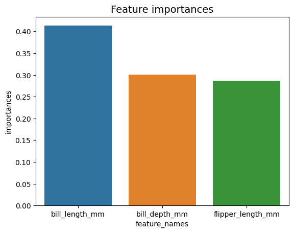
A common way of representing importance values is by using bar chats. Let’s first create a dataframe with the feature names and their corresponding importances, and then visualize them using Seaborn’s barplot():
importances_df = pd.DataFrame({"feature_names" : rf.feature_names_in_,
                               "importances" : rf.feature_importances_})


g = sns.barplot(x=importances_df["feature_names"],
                y=importances_df["importances"])
g.set_title("Feature importances", fontsize=14);
Advice: A good practice when presenting information is to order values either in ascending or descending order. In this case, the data is already ordered, with the first value being the first we want to know. When this isn’t the case, you can order the dataframe with sort_values. This can be done on any column in ascending or descending order: importances_df.sort_values(by="importances", ascending=False).
When looking at this first plot, it’s harder to interpret the value of each feature’s importance. It obvious that the bill length is larger than the other two bars, but not exactly that the bill_depth_mm is equivalent to 0.30107056, and that the flipper_length_mm is 0.28625311. So, this first chart can be improved by displaying the value of each bar. This can be done by accessing Seaborn’s containers object. It stores each bar information and passing the values as bar labels:
Check out our hands-on, practical guide to learning Git, with best-practices, industry-accepted standards, and included cheat sheet. Stop Googling Git commands and actually learn it!
g = sns.barplot(data=importances_df,
                x="importances",
                y="feature_names")
g.set_title("Feature importances", fontsize=14)
for value in g.containers:
    g.bar_label(value)

Now, we can see each importance value clearly, or almost clearly, because bill_length_mm value is being cut by a vertical line that is part of the charts outer border. Borders are used to enclose an area as a means of focusing more attention on it, but in this case, we don’t need to enclose, because there is only one graph. Let’s remove the border and improve the numbers’ readability:
g = sns.barplot(data=importances_df,
                x="importances",
                y="feature_names")


sns.despine(bottom=True, left=True)
g.set_title("Feature importances", fontsize=14)
for value in g.containers:
    g.bar_label(value)
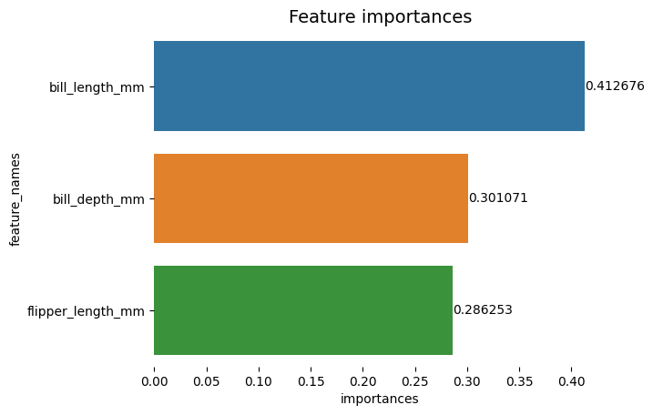
The chart seems easier to read, but the ticks on the X-axis seem to be floating and we already have the values along with the bars, so we can remove the xticks:
g = sns.barplot(data=importances_df,
                x="importances",
                y="feature_names")
sns.despine(bottom=True, left=True)


g.set(xticks=[])
g.set_title("Feature importances", fontsize=14)
for value in g.containers:
    g.bar_label(value)
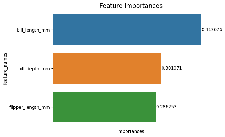
Notice how after removing the ticks, the Y and X labels are a bit hard to read. The Y-label, feature_names, is vertical and in the X-axis, there are only importances. Since the title already states that the chart is of Feature importances, we can also remove the axis labels:
g = sns.barplot(data=importances_df,
                x="importances",
                y="feature_names")
sns.despine(bottom=True, left=True)
g.set_title("Feature importances", fontsize=14)
g.set(xticks=[])


g.set(xlabel=None)
g.set(ylabel=None)
for value in g.containers:
    g.bar_label(value)
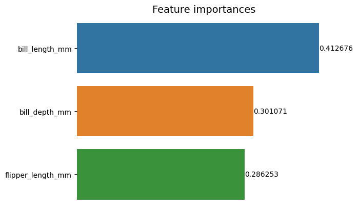
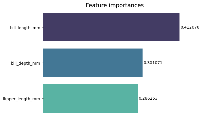
You can see how this chart is cleaner, easy to read and understand when comparing with the first one. There are still some things we can do. Observe that the numbers are really close to the bars, it would be easier to read if there was a little more space between them.
Another element in this plot are the colors, when contrasting colors are used, it transmits an idea of separation, on the other way around, when similar colors are used, they communicate an idea of unity, or parts of a whole. Since the features are all part of penguins, we can use a colors that makes each bar distinct while maintaining unity:
g = sns.barplot(data=importances_df,
                x="importances",
                y="feature_names",


                palette="mako")
sns.despine(bottom=True, left=True)
g.set_title("Feature importances", fontsize=14)
g.set(xticks=[])
g.set(xlabel=None)
g.set(ylabel=None)
for value in g.containers:
    g.bar_label(value,
                padding=2)
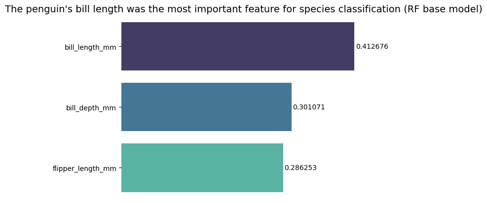
If you want to make the results even more direct, you can change the title and add the conclusion. What is known is that the bill length was considered the most important feature according to the criteria we have previously discussed. This can be the first information for someone that looks at the plot, we could say that the penguin’s bill length was the most important feature for species classification in the Random Forest (RF) base model :
g = sns.barplot(data=importances_df,
                x="importances",
                y="feature_names",
                palette="mako")
sns.despine(bottom=True, left=True)
g.set_title("The penguin's bill length was the most important feature for species classification (RF base model)", fontsize=14)
g.set(xticks=[])
g.set(xlabel=None)
g.set(ylabel=None)
for value in g.containers:
    g.bar_label(value, padding=2)
This is the final result of the feature importances chart:
Conclusion
In this guide – we’ve built a Random Forest Classifier – and inspected the feature importances that were used to train the model in an attempt to explain what a model has learned, and what affects its reasoning.

