Matplotlib isn’t only for static plots. While GUIs are typically created with GUI libraries and frameworks such as PyQt, Tkinter, Kivy and wxPython, and while Python does have excellent integration with PyQt, Tkinter and wxPython – there’s no need to use any of these for some basic GUI functionality, through Matplotlib Widgets.
The matplotlib.widgets module has several classes, including the AxesWidget, out of which Buttons, CheckButtons, Sliders, TextBoxes, etc are derived. These all accept the Axes they’re being added to as the one and only mandatory constructor argument, and their positioning has to be manually set. A thing to note is that the widget is the axes, so you’ll create an Axes instance for each widget.
Another thing to note is that you have to keep references to the widgets otherwise, they might get garbage collected.
Each of them can also be disabled by setting active to False, in which case, they won’t respond to any events, such as being clicked on. That being said, we can introduce a new type of interactivity to our plots, through various GUI elements and components.
Note: Matplotlib isn’t meant to be used for high-quality GUI creation, nor user-friendly systems. These widgets are rudimentary, don’t really look great and have limited functionality. They’re meant as a way to prototype and test things out, rather than actually ship them.
If you’ve worked with PyQt before – you might notice that the general syntax and approach to adding these widgets, as well as connecting them to event handlers is fairly familiar.
Adding Buttons
Let’s start out with buttons – the matplotlib.widgets module defines a Button class. To connect to it, we call the on_clicked() function, which executes the function we supply. Once a click has been detected, the function executes.
While creating the button, we assign an Axes to it, used for positioning. We can also pass in a label at that time, to add some text and annotate it for a user. The color and hovercolor arguments define the color of the button before and after it’s being hovered over.
Since we take care of the positioning and space for all widgets – let’s create a Figure and Axes, allow for some spacing at the bottom to add a button, and plot an empty Scatter Plot. Then, we’ll define an EventHandler class, that has a single method add_random(). The method generates two random numbers, and plots a marker for them on the Axes we’ve created before and calls plt.draw(), which re-draws the Figure. When updating plots, we’ll always have to call plt.draw() again to actually update it:
import numpy as np
import matplotlib.pyplot as plt
from matplotlib.widgets import Button fig, ax = plt.subplots()
fig.subplots_adjust(bottom=0.2)
plot = ax.scatter([], []) class EventHandler: def add_random(self, event): x = np.random.randint(0, 100) y = np.random.randint(0, 100) ax.scatter(x, y) plt.draw() # Axes for the Button and positioning
# xposition and yposition in percentages, width, height
button_ax = plt.axes([0.7, 0.05, 0.2, 0.07])
# Create Button and assign it to `button_ax` with label
button = Button(button_ax, 'Add Random', color='green', hovercolor='red')
# On a detected click, execute add_random()
button.on_clicked(EventHandler().add_random) plt.show()
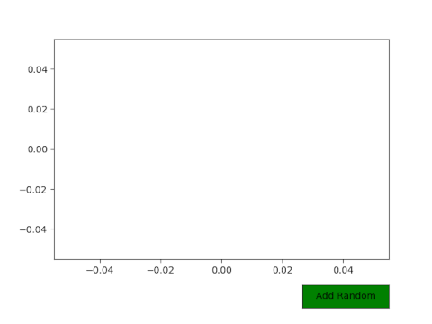
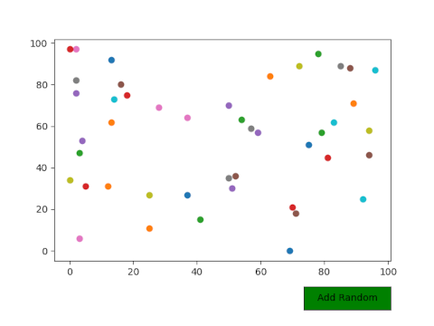
This results in a Figure, with an empty Axes inside of it and a button on the top right-hand corner of the screen, in its own Axes:

And after pressing the button a couple dozen times, our ax will be populated with random markers:
In more practical terms, we could create a cycle of features to get plotted on each button press. This requires a few tweaks to the EventHandler, as well as another button to go back through that cycle.
Let’s use the Red Wine Quality dataset again, and visualize several features against the Alcohol feature. Since we can’t be bothered to plot these individually by writing the code to plot one feature against the other, and then modifying that code to plot another feature against the other.
Creating a Scatter Matrix might help us here, but if the dataset has a lot of features, it’ll be fairly unreadable and we won’t get far. If you’d like to have both large-scale plots that you can easily view and interpret, as well as having multiple features cycling through without any extra effort – you can automate this process with buttons:
import numpy as np
import pandas as pd
import matplotlib.pyplot as plt
from matplotlib.widgets import Button fig, ax = plt.subplots()
fig.subplots_adjust(bottom=0.2) df = pd.read_csv('winequality-red.csv')
plot = ax.scatter([], []) class EventHandler: i = 0 # Find and plot next feature, re-draw the Axes def next_feature(self, event): # If the counter is at the end of the columns # Revert it back to 0 to cycle through again if self.i >= len(df.columns): self.i = 0 # Clear Axes from last plot ax.cla() # Plot a feature against a feature located on the `i` column ax.scatter(df['alcohol'], df.iloc[:,self.i]) # Set labels ax.set_xlabel('Alcohol') ax.set_ylabel(df.columns[self.i]) # Increment i self.i += 1 # Update Figure plt.draw() def previous_feature(self, event): # If the counter is at the start of the columns # Revert it back to the last column to cycle through if self.i <= 0: self.i = len(df.columns)-1 ax.cla() ax.scatter(df['alcohol'], df.iloc[:,self.i]) ax.set_xlabel('Alcohol') ax.set_ylabel(df.columns[self.i]) self.i -= 1 plt.draw() # Add buttons
button1_ax = plt.axes([0.7, 0.02, 0.2, 0.07])
next_button = Button(button1_ax, 'Next Feature')
next_button.on_clicked(EventHandler().next_feature) button2_ax = plt.axes([0.45, 0.02, 0.2, 0.07])
previous_button = Button(button2_ax, 'Previous Feature')
previous_button.on_clicked(EventHandler().previous_feature) plt.show()
The EventHandler class now has two methods – next_feature() and previous_feature(). Both of these check whether the counter i has reached the end or start of the column list – and to avoid an IndexError, we reset the index to the opposite value and simulate a cycle. Going below 0 will get us back to the end of the column list, and going above the last column will revert us back to the first.
After ascertaining where we’re located – we clear the Axes, since we’d be plotting again on top of an existing plot without clearing it via cla() (clear axes). You could alternatively pile up feature relations as well, by plotting on top of each other and use the cla() statement when resetting the index at the end/start of the cycle.
After clearing the Axes – we’ve got a cleared canvas to paint on with the ax.scatter() function. In this example, the fixed feature is Alcohol, so it’s present at all times. The other feature varies, and can be accessed through iloc[], passing in the index of the column. This returns a Series that we can use in this plot. Similarly, we can access column names through their index as well – df.columns[index], which is used to set the Y-axis label.
Finally, we increase/decrease the counter and call plt.draw() to update the Figure:

Once we click on the Next Feature button, the next feature in the list of columns will be plotted against Alcohol, and the Figure will be appropriately updated – the labels, markers and scale. The same goes the other way around – Previous Feature will traverse the list in the opposite direction, allowing us to cycle back and forth, with a safety mechanism that resets our counter each time we get to the end or beginning of the cycle.
Adding Radio Buttons and Check Boxes
Radio Buttons are used to allow a user to select one value out of several values. Only one radio button can be selected at a time, and they typically represent a choice. Check Boxes can be used if you’d like to let the user select multiple options at once.
Note: There is very limited ability to check whether a checkbox is on or off. In fact, there’s none out of the box. You can only ever check if the box is pressed or not, which poses a serious limitation to how it can be used since we have no idea in which state it was before that. The only alternative is to keep your own counter/check as to the current state of the box with a boolean, and alter the logic based on that.
This would allow you to, for example, add a checkbox for each customization argument of a certain plot, allowing the user to set them True or False (checked, or unchecked), or any other non-conflicting mapping based on these states.
Though, since the API is limited itself, we’ll limit ourselves to the intended usage as well – turning things on and off. We’ll have two features, that we can turn on and off via a Checkbox. Note that even this functionality is limited to objects for which you can check if they’re visible or not.
On the other hand, we don’t want to allow the user to apply two scales at once, or to set two X-limits at once, since only the statement called second in the sequence would be applied. For these – we’d use Radio Buttons.
Let’s add a couple of Radio Buttons to let the user select the axis range via a couple of Radio Buttons, but also allow them turn feature visualizations on and off:
import pandas as pd
import matplotlib.pyplot as plt
from matplotlib.widgets import CheckButtons
from matplotlib.widgets import RadioButtons fig, ax = plt.subplots()
fig.subplots_adjust(bottom=0.2) df = pd.read_csv('winequality-red.csv') # Plot two line plots for two features, and turn them invisible
line1, = ax.plot(df['fixed acidity'], visible=False)
line2, = ax.plot(df['citric acid'], visible=False) class EventHandler: # set_range handler def set_range(label): if (label == 'Small Range'): ax.set_xlim(0, 1600) ax.set_ylim(0, 25) else: ax.set_xlim(0, 1600) ax.set_ylim(0, 50) plt.draw() # Turn off, if on, and on if off def apply_features(label): if (label == 'Fixed Acidity'): line1.set_visible(not line1.get_visible()) elif (label == 'Citric Acid'): line2.set_visible(not line2.get_visible()) plt.draw() # Add radio buttons and checkboxes
ranges_ax = plt.axes([0.7, 0.02, 0.2, 0.1])
range_radio_buttons = RadioButtons(ranges_ax, ('Small Range', 'Large Range'))
range_radio_buttons.on_clicked(EventHandler.set_range) checkboxes_ax = plt.axes([0.4, 0.02, 0.25, 0.1])
checkboxes = CheckButtons(checkboxes_ax, ('Fixed Acidity', 'Citric Acid'))
checkboxes.on_clicked(EventHandler.apply_features) plt.show()
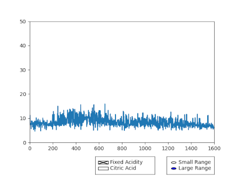
Again, we’ve got two methods in the EventHandler() class – set_range() and apply_features(). The set_range() method sets the range to either “small” or “large”, by adjusting the Axes‘ X and Y-limits. The apply_features() function alters the visible field of the Line Plots we made earlier, based on their current visible status. If visible == True, we turn the Line Plot off, and vice versa.
We have to rely on the built-in ability to check the visibility of Line Plots, since we can’t check if the checkbox was checked or not before. This same ability can be emulated with a status boolean in the scope of the EventHandler() class, which is set to True and False on every click, for plot types that don’t support checking if they’re visible out of the box.
Running this code results in a Figure with two sets of buttons at the bottom. If we check both checkboxes, both Line Plots will appear:

We can turn them off individually:
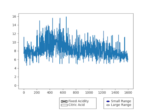
And we can change the range of the Axes via the Radio Buttons:
Adding Textboxes
Textboxes are used to collect data from the user – and we can alter the plots based on this data. For example, we can ask a user to input the name of a feature, or to insert a function for our plot to visualize. Of course, working with user input can be tricky – there are always edge cases to look out for.
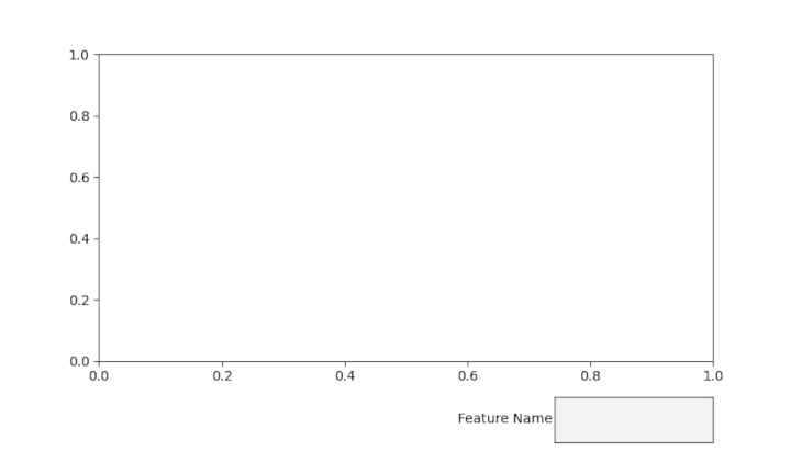
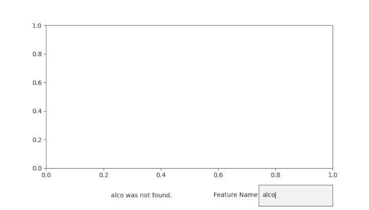
Let’s write a script that allows the user to input a feature name of a dataset, and the Axes updates on each submission to reflect the input. For the convenience of the user, we’ll let them know if the input couldn’t be matched with a column name:
import pandas as pd
import matplotlib.pyplot as plt
from matplotlib.widgets import TextBox fig, ax = plt.subplots()
fig.subplots_adjust(bottom=0.2) df = pd.read_csv('winequality-red.csv') class EventHandler: def submit(feature_name): if feature_name != "" or feature_name != None: if feature_name in df: ax.cla() ax.plot(df[feature_name]) else: if len(textbox_ax.texts) > 2: del textbox_ax.texts[-1] textbox_ax.text(-2, 0.4, feature_name + ' was not found.') plt.draw() textbox_ax = plt.axes([0.7, 0.02, 0.2, 0.1])
textbox = TextBox(textbox_ax, 'Feature Name')
textbox.on_submit(EventHandler.submit) plt.show()
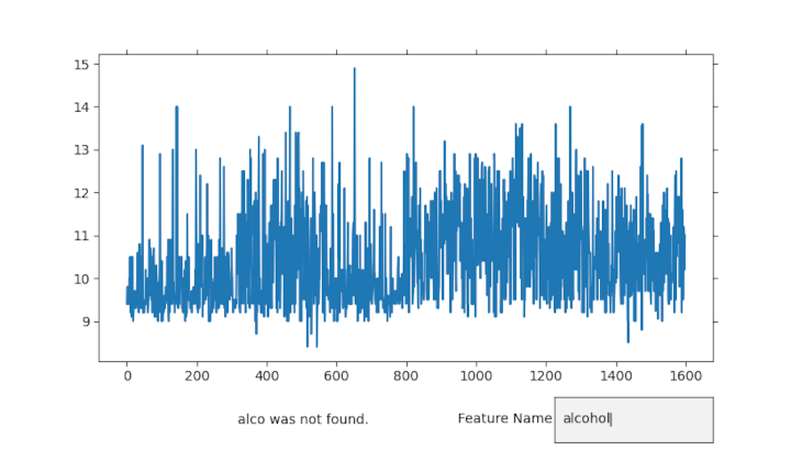
We have a simple check to see if the provided feature_name is blank or None, in which case, we don’t do anything. If not, we check if the feature_name is present in the DataFrame, attaching a message that the feature wasn’t found if it’s not present. Before attaching the text though, we have to make sure that the previous message is removed, so that the new one doesn’t overlap with it. The axes.texts property is a list of all the Text instances on an Axes. Since the Axes already has a Text instance, belonging to our TextBox, we don’t want to remove anything if there are 2 or less Text instances present – the error message and the TextBox label.
If above two, we’ve already got an error message, which should be removed.
If the feature is present in the DataFrame, though, we clear the Axes and plot it:
Adding Span Selectors
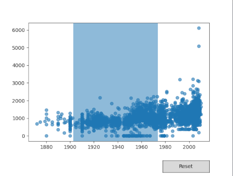
Span Selectors can be used to allow the user to select a span of data and focus on it, setting the axis limits based on that selection. By default, many libraries support this functionality, though unfortunately, Matplotlib doesn’t and we’ll have to do this manually. Additionally, we’ll have to add an extra “Reset” button if we want to zoom out as well.
To add a Span Selector, we don’t need to dedicate an entire new Axes for it – we can attach it to an existing one, which makes a lot of sense. When generating a SpanSelector, we supply the Axes it belongs to, as well as the event handler, followed by 'horizontal' or 'vertical', which rotates the Axes and Span Selector both.
The useblit argument is typically set to True because it enhances performance on most backends. Additionally, we’ve added a few styling properties, such as setting the alpha of the rectangle created as a Span Selector to 0.5 and the facecolor to a nice tab:blue:
import numpy as np
import pandas as pd
import matplotlib.pyplot as plt
from matplotlib.widgets import SpanSelector
from matplotlib.widgets import Button fig, ax = plt.subplots()
fig.subplots_adjust(bottom=0.2) df = pd.read_csv('AmesHousing.csv') ax.scatter(x = df['Year Built'], y = df['Total Bsmt SF'], alpha = 0.6) class EventHandler: def select_horizontal(x, y): ax.set_xlim(x, y) plt.draw() def reset(self): ax.set_xlim(df['Year Built'].min(), df['Year Built'].max()) plt.draw span_horizontal = SpanSelector(ax, EventHandler.select_horizontal, 'horizontal', useblit=True, rectprops=dict(alpha=0.5, facecolor='tab:blue')) button_ax = plt.axes([0.7, 0.02, 0.2, 0.07])
button = Button(button_ax, 'Reset')
button.on_clicked(EventHandler.reset) plt.show()
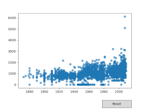
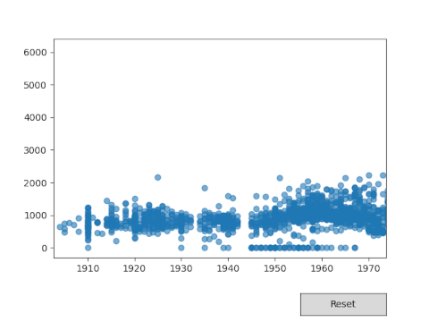
Running this generates a plot on which we can select spans and zoom in on them by setting the Axes-limits to the provided values:
Adding Sliders
Sliders allow users to select between many values intuitively by sliding a marker and selecting a value. Typically, sliders are used to continuously update some value on a plot, such as its range or even a feature. For example, you can adjust the value of a constant through a slider, which in turn affects a function that relies on that constant.
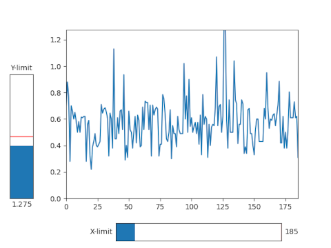
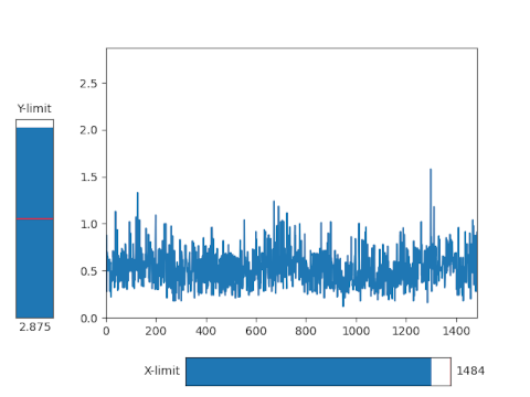
Let’s write a script that allows us to change the Y and X-axis limits, through a slider, which will let us change the perspective from which we’re viewing our data:
import pandas as pd
import matplotlib.pyplot as plt
from matplotlib.widgets import Slider fig, ax = plt.subplots()
fig.subplots_adjust(bottom=0.2, left=0.2) df = pd.read_csv('winequality-red.csv')
plot, = ax.plot(df['volatile acidity']) class EventHandler: def update(val): ax.set_ylim(0, yslider.val) ax.set_xlim(0, xslider.val) plt.draw() xslider_ax = plt.axes([0.35, 0.03, 0.5, 0.07])
xslider = Slider( ax=xslider_ax, label="X-limit", valmin=0, valmax=len(df['volatile acidity']), valinit=len(df['volatile acidity']), orientation="horizontal"
) yslider_ax = plt.axes([0.03, 0.2, 0.07, 0.5])
yslider = Slider( ax=yslider_ax, label="Y-limit", valmin=0, valmax=3, valinit=1.5, orientation="vertical"
) xslider.on_changed(EventHandler.update)
yslider.on_changed(EventHandler.update) plt.show()
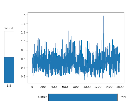
We’ve adjusted the padding to allow for a slider on the left and bottom of the Axes, and plotted a simple Line Plot. Adding a slider requires us to make an Axes for it, like with most other widgets, and assign it to the ax argument of the Slider through the constructor. Additionally, we can set the minimum, maximum and initial values of the slider. These will typically be dynamic ranges, based on the data you’re plotting, but can also be manually set scalar values.
Finally, Sliders can be oriented horizontally or vertically. Since they’re meant to be continually updated via a mouse-swipe – the on_changed() function is used to trigger a response when a user gives input. We’ve tweaked the EventHandler class with an update() function that simply adjusts the values of the X and Y-limits based on the value of the respective sliders.
Running this code will produce a plot with two sliders, that we can use to change the scope of the Axes:
- access
- All
- Allowing
- already
- Another
- api
- approach
- arguments
- around
- Beginning
- being
- Box
- built-in
- call
- care
- cases
- change
- checking
- code
- Column
- could
- Couple
- Creating
- Current
- Current state
- data
- dedicate
- detected
- dozen
- dynamic
- easily
- Edge
- Event
- events
- example
- excellent
- Feature
- Features
- First
- Focus
- found
- function
- functionality
- General
- going
- great
- Green
- having
- help
- here
- How
- HTTPS
- idea
- Including
- index
- integration
- IT
- Labels
- large
- Limited
- Line
- List
- Matrix
- most
- numbers
- Options
- Other
- otherwise
- performance
- perspective
- present
- press
- process
- produce
- property
- Radio
- range
- RE
- response
- Results
- returns
- Safety
- Said
- Scale
- Screen
- selected
- sense
- set
- setting
- Simple
- small
- So
- Space
- start
- State
- Statement
- States
- Status
- supply
- support
- Systems
- test
- Through
- time
- top
- Update
- Updates
- us
- users
- value
- View
- visibility
- visible
- whether
- without
- worked
- working
- writing
- X
- year
- zoom

