Pandas has been aiding us so far in the phase of Data Preprocessing. Though, in one instance, while creating Histograms, we’ve also utilized another module from Pandas – plotting.
We’ve purposefully avoided is so far, because introducing it earlier would raise more questions than it answered. Namely, Pandas and Matplotlib were such a common an ubiquitous duo, that Pandas has started integrating Matplotlib’s functionality. It heavily relies on Matplotlib to do any actual plotting, and you’ll find many Matplotlib functions wrapped in the source code. Alternatively, you can use other backends for plotting, such as Plotly and Bokeh.
However, Pandas also introduces us to a couple of plots that aren’t a part of Matplotlib’s standard plot types, such as KDEs, Andrews Curves, Bootstrap Plots and Scatter Matrices.
The plot() function of a Pandas DataFrame uses the backend specified by plotting.backend, and depending on the kind argument – generates a plot using the given library. Since a lot of these overlap – there’s no point in covering plot types such as line, bar, hist and scatter. They’ll produce much the same plots with the same code as we’ve been doing so far with Matplotlib.
We’ll only briefly take a look at the plot() function since the underlying mechanism has been explored so far. Instead, let’s focus on some of the plots that we can’t already readily do with Matplotlib.
This will be a very short chapter, as Pandas’ plotting and visualization capabilities pale in comparison to Matplotlib – but it’s still useful to know of some of these, as well as be aware of the ability to plot from DataFrames directly.
The DataFrame.plot() Function
The plot() function accepts x and y features, and a kind argument. Alternatively, to avoid the kind argument, you can also call DataFrame.plot.kind() instead, and pass in the x and y features.
The accepted values for the kind argument are: line, bar, barh (horizontal bar), hist, box, kde, density (synonym for kde), area, pie, scatter and hexbin (similar to a Heatmap).
import pandas as pd
from matplotlib import pyplot as plt df = pd.read_csv('gdp_csv.csv')
df_eu = df.loc[df['Country Name'] == 'European Union'] df_eu.plot.bar(x = 'Year', y = 'Value')
df_eu.plot.line(x = 'Year', y = 'Value')
df_eu.plot.box(x='Value') plt.show()
Instead of providing the Series instances like we do for Matplotlib – it’s enough to provide the column names, and since you’re calling the plot() function on the DataFrame you’re visualizing, it’s easy for Pandas to map these string values to the appropriate column names.
Each of these calls makes a new Figure instance and plots the appropriate values on it:

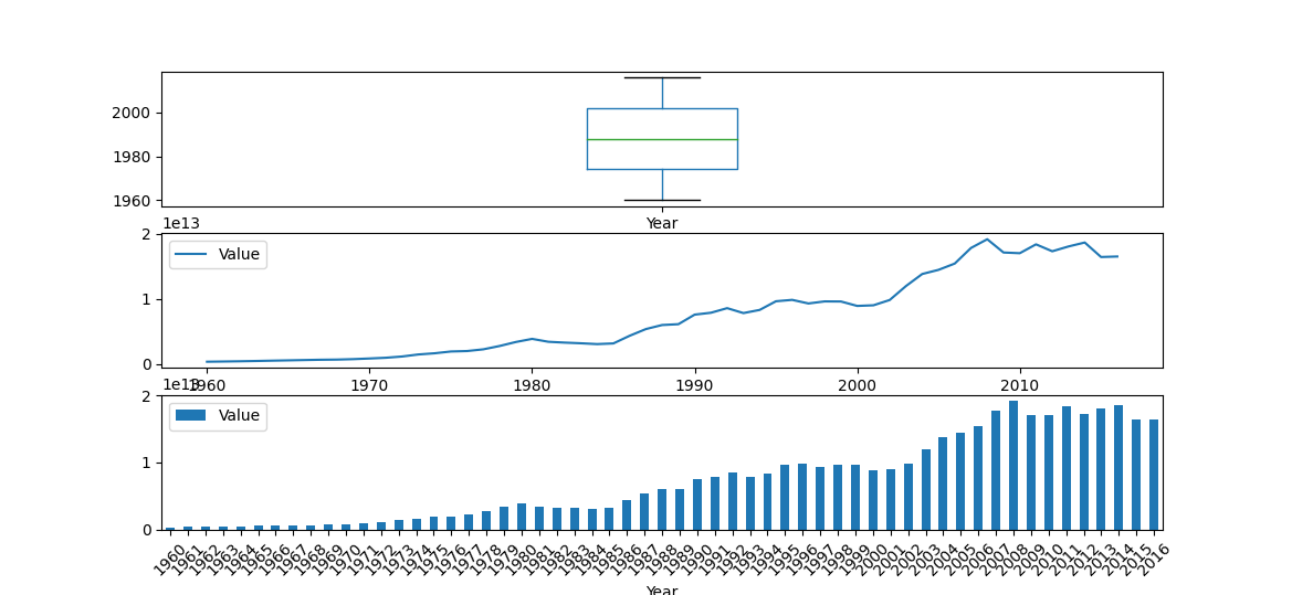
To plot multiple axes on the same Figure, you can make a Figure and one or more Axes via plt.subplots() and assign the appropriate Axes to the ax argument of each plot.plot_type() call:
import pandas as pd
from matplotlib import pyplot as plt df = pd.read_csv('gdp_csv.csv')
df_eu = df.loc[df['Country Name'] == 'European Union'] fig, ax = plt.subplots(3, 1) df_eu.plot.box(x='Value', ax = ax[0])
df_eu.plot.line(x = 'Year', y = 'Value', ax = ax[1])
df_eu.plot.bar(x = 'Year', y = 'Value', rot = 45, ax = ax[2]) plt.show()
Some of the standard arguments, such as the rotation argument are actually different in the plot() calls. For example, rotation is shortened to rot. This makes it a bit tricky to just switch between Matplotlib and Pandas, as you’ll most likely end up in the documentation pages, just checking which arguments can be applied and which can’t.
Now, instead of creating a new Figure or Axes instance, each of these plots will be stationed in the appropriate Axes instances we’ve supplied them with:
In general, plotting with Pandas is convenient and quick – but even so, for plotting Bar Plots, Line Plots and Box Plots, you’ll probably want to go with Matplotlib. It’s both the underlying engine Pandas inevitably uses, and also has more customization options, and you won’t have to remember a new set of arguments that you can use with Pandas plots.
That being said, for some plots, you might want to prefer Pandas, since they’d have to be manually made in Matplotlib, and some of them are such a hassle to make that it’s not worth the effort, such as KDE lines.
Pandas’ plotting Module
What DataFrames have to offer in terms of visualization isn’t too new to us. However, the underlying module they call, pandas.plotting does. The plotting module has several functions that we can use, such as autocorrelation_plot(), bootstrap_plot(), and scatter_matrix().
Each of these accept either a Series or a DataFrame, depending on the type of visualization they’re producing, as well as certain parameters for plotting specification and styling purposes.
Bootstrap Plot
Bootstrapping is the process of randomly sampling (with replacement) a dataset, and calculating measures of accuracy such as bias, variance and confidence intervals for the random samples. “With replacement”, in practical terms, means that each randomly selected element can be selected again. Without replacement means that after each randomly selected element, it’s removed from the pool for the next sample.
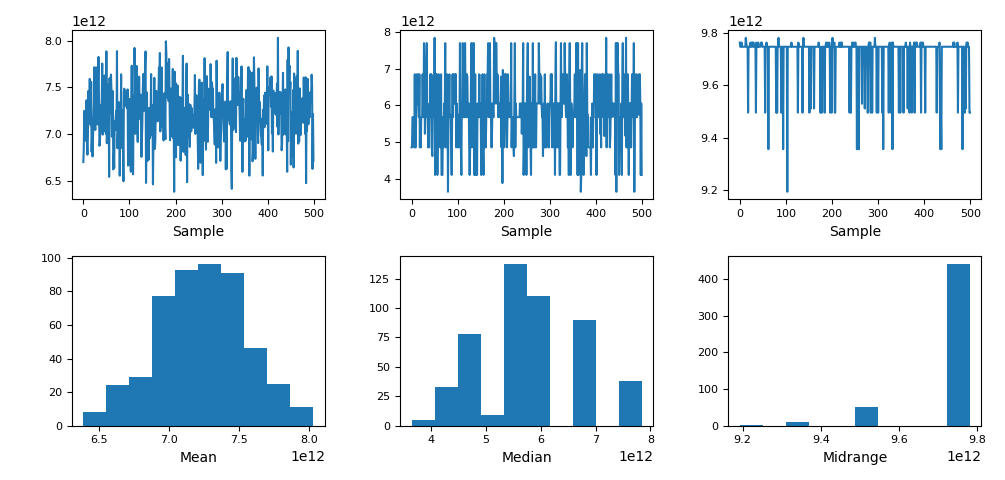
A Bootstrap Plot, created by Pandas bootstraps the mean, median and mid-range statistics of a dataset, based on the sample size, after which the plot is subsequently shown via plt.show(). The default arguments for size and samples are 50 and 500 respectively.
This means that for a feature, we sample 50 values. Then, a 50-element subsample is generated (synthetic data) for those 50 values and a summary statistic (mean/median/mid-range) is calculated for them. This process is repeated 500 times, so in the end, we’ve got 500 summary statistics:
import pandas as pd
from matplotlib import pyplot as plt df = pd.read_csv('./datasets/gdp_csv.csv')
df_eu = df.loc[df['Country Name'] == 'European Union'] pd.plotting.bootstrap_plot(df_eu['Value']) plt.show()
Autocorrelation Plot
Autocorrelation Plots are used to check for data randomness, for time-series data. Multiple autocorrelations are calculated for differing timestamps, and if the data is truly random – the correlation will be near zero. If not – the correlation will be larger than zero.
Let’s plot two Autocorrelation Plots – one with our Value feature, and one with a Series filled with random values:
import pandas as pd
import numpy as np
from matplotlib import pyplot as plt df = pd.read_csv('gdp_csv.csv')
# Filter DataFrame for the EU
df_eu = df.loc[df['Country Name'] == 'European Union']
# Generate 50 random integers between 0 and 100, and turn into a Series
random_series = pd.Series(np.random.randint(0, 100, size=50)) # Plot Autocorrelation Plot for the *Value* feature
pd.plotting.autocorrelation_plot(df_eu['Value'])
# Plot Autocorrelation Plot for the *random_series*
pd.plotting.autocorrelation_plot(random_series) plt.show()
The Autocorrelation Plot for the random_series should revolve around 0, since it’s random data, while the plot for the Value feature won’t:
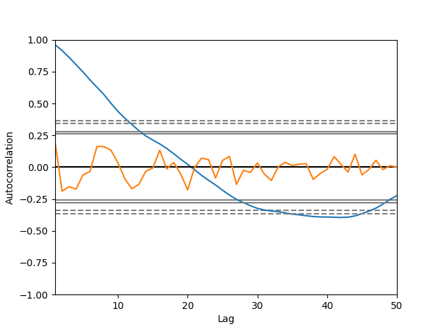
It’s worth noting that Autocorrelation measures one form of randomness, as uncorrelated, but non-random data does exist. If it’s non-random, but doesn’t have any significant correlations – the Autocorrelation Plot would indicate that the data is random.
Scatter Matrices
Scatter Matrices plot a grid of Scatter Plots for all features against all features. Since this inevitably compares each feature with itself, as well – the diagonal where this happens is typically replaced with a Histogram of that feature, rather than a Scatter Plot. Scatter Matrices are also known as Pair Plots, and Seaborn offers a pairplot() function just for this.
The scatter_matrix() function accepts a DataFrame and produces a Scatter Matrix for all of its numerical features, and returns a 2D array of Axes instances that comprise the Scatter Matrix. To tweak anything about them, you’ll want to iterate through them:
import pandas as pd
import numpy as np
from matplotlib import pyplot as plt df = pd.read_csv('worldHappiness2019.csv') axes = pd.plotting.scatter_matrix(df, diagonal='hist') for ax in axes.flatten(): # Rotate back to 0 degrees since they're automatically rotated by 90 ax.yaxis.label.set_rotation(0) # As to not overlap with the Axes instances, set the ticklabel # alignment to 'right' ax.yaxis.label.set_ha('right') plt.show()
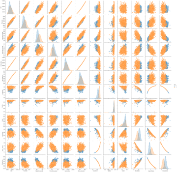
This results in a rather large Scatter Matrix of all the features against all other features:
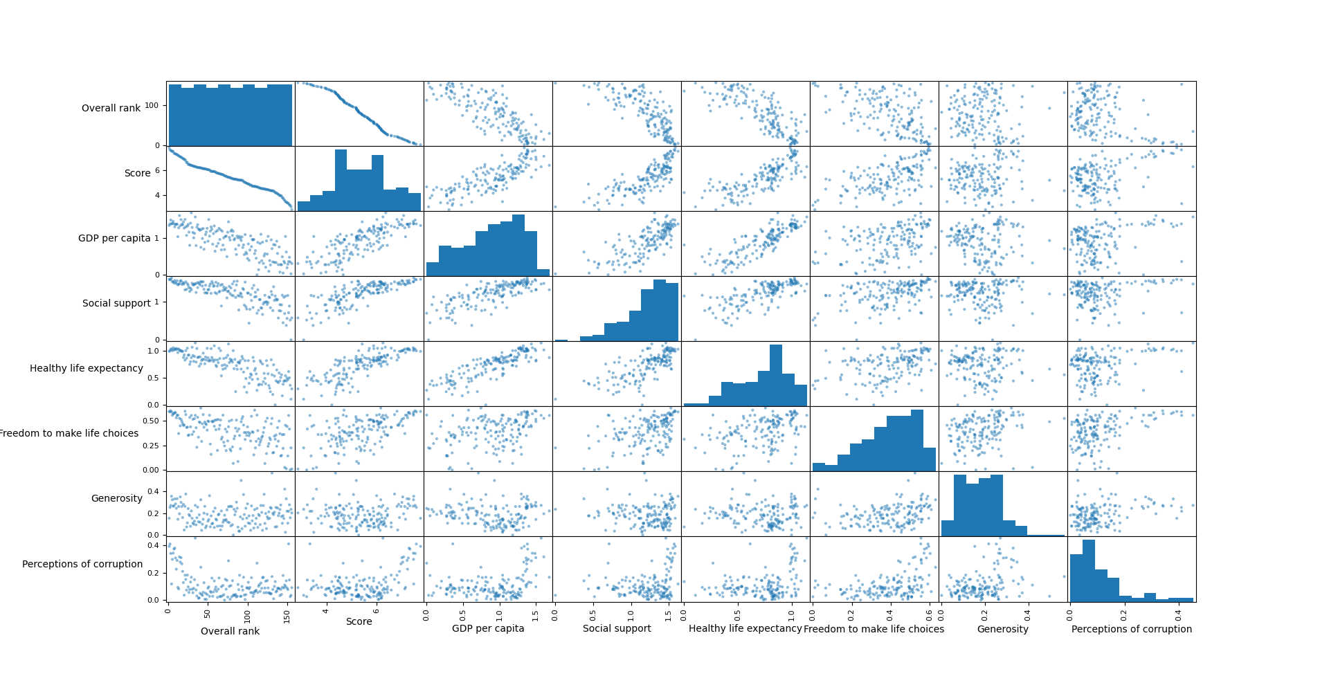
You can also pass in the diagonal argument, which accepts 'hist' or 'kde' to specify what type of distribution plot you’d like to plot on the diagonal, as well as alpha, specifying the translucency of the markers in the Scatter Plots.
- 100
- About
- All
- already
- Another
- arguments
- around
- being
- Bit
- Box
- call
- capabilities
- Chapter
- checking
- code
- Column
- Common
- country
- Couple
- Creating
- data
- different
- distribution
- European
- european union
- example
- Feature
- Features
- Focus
- function
- functionality
- General
- generate
- HTTPS
- IT
- known
- large
- larger
- Library
- Line
- map
- Matrix
- most
- namely
- names
- Near
- offer
- Offers
- Options
- Other
- phase
- pool
- process
- produce
- provide
- purposes
- raise
- RE
- replaced
- Results
- returns
- Said
- selected
- set
- Short
- significant
- similar
- So
- source code
- specification
- started
- statistics
- The Source
- Through
- union
- us
- value
- visualization
- What
- Wikipedia
- worth
- X
- year
- zero


