Executive Summary:
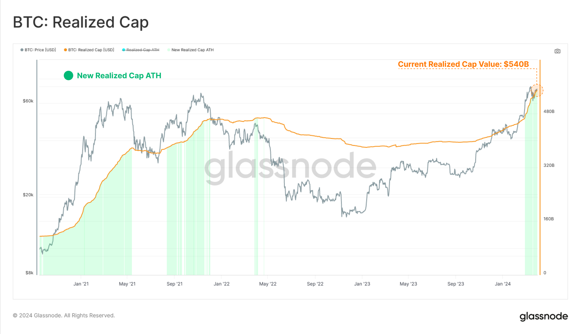
- Capital continues to flow into Bitcoin, with the Realized Cap rising to a new high of $540B, and seeing rates of capital inflow into the asset now exceeding $79B/month.
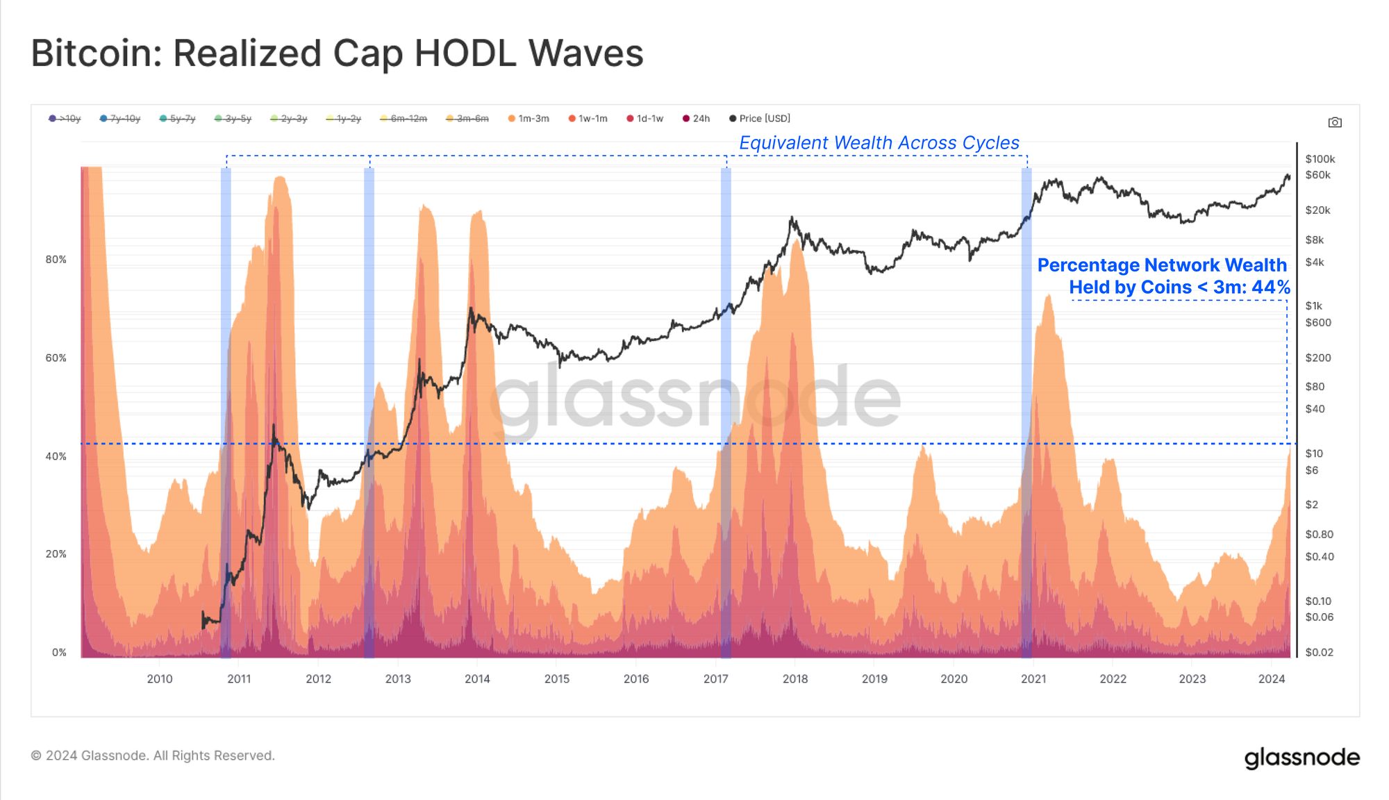
- The transfer of wealth from Long-Term Holders back to new demand is accelerating, with over 44% of the network wealth now owned by coins aged less than 3 months old.
- Profit taking continues to dominate investor behavior, with both the Long and Short-Term Holder cohorts taking chips off the table. Overall profit dominance is however shifting towards the Long-Term Holders.
A Rising Tide of Liquidity
Bitcoin’s price action decisively broke above the previous cycle ATH in early March, triggering a transition into price discovery. As we covered last week (WoC-13), this has motivated a significant volume of supply to be spent and take profits.
This results in spent coins generally being revalued from a lower cost-basis, to a higher one. As these coins change hands, we can also consider this to be an injection of fresh demand and liquidity into the asset class.
This mechanic is elegantly expressed by the Realized Cap metric, tracking the cumulative USD liquidity ‘stored’ in the asset the class. The Realized Cap is now at a new ATH value of $540B, and is increasing at an unprecedented rate of over $79B/month.

We can break down the age bands of the Realized Cap using the Realized Cap HODL Wave metric. This tool is particularly useful for distinguishing the distribution of USD denominated wealth held across various age bands.
If we segregate for coin-ages younger than 3 months, we can see a sharp increase over recent months, with these newer investors now owning ~44% of the aggregate network wealth. This uptick in younger coins is a direct result of Long-Term Holders spending their coins at higher prices to satisfy the wave of inflowing demand.
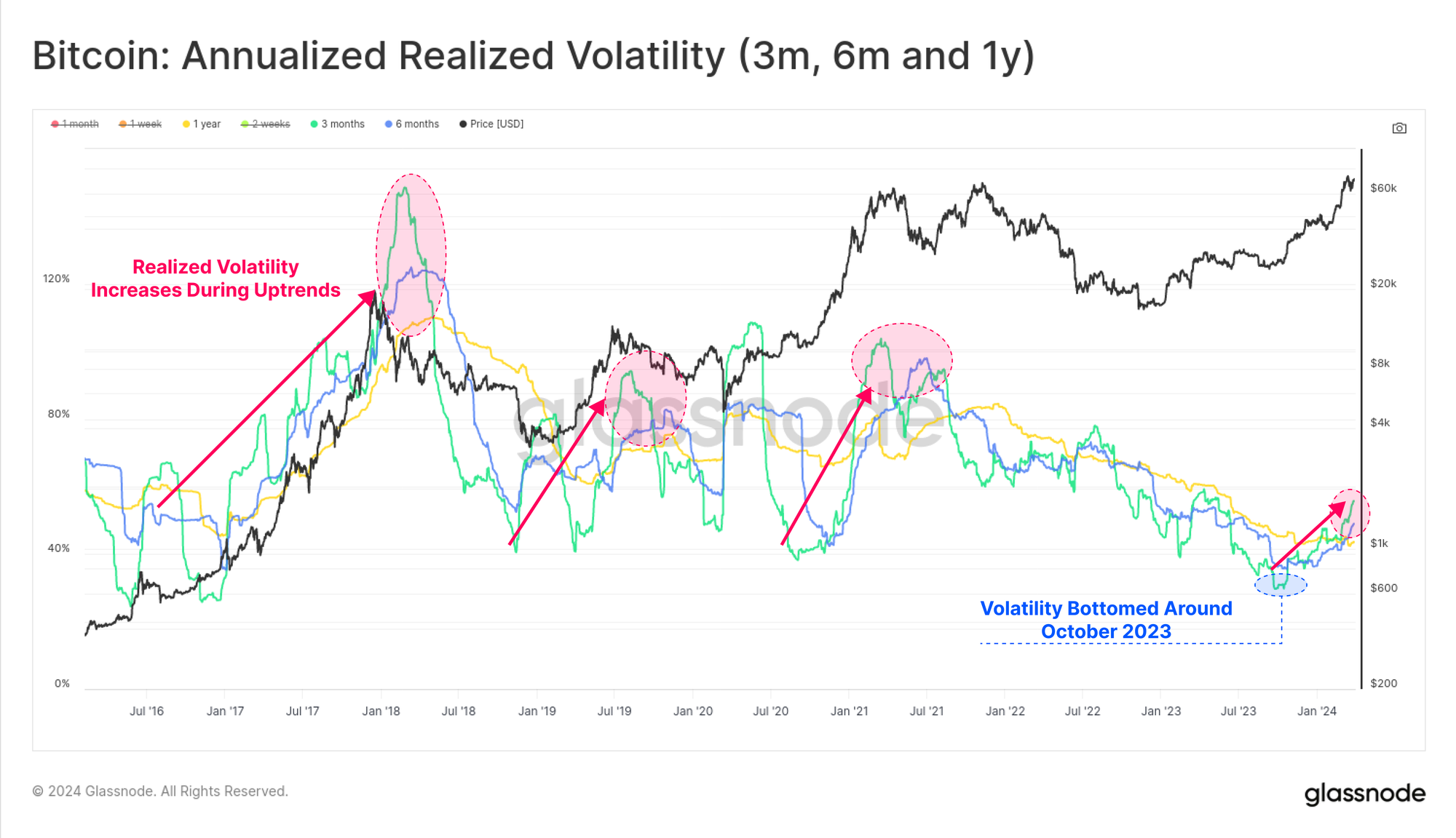
It is typical in prior Bitcoin cycles that an uptick in new demand tends to come alongside an elevated appetite for speculation. This tends to result in increasingly volatile markets, which is characteristic of macro up-trends in prior Bitcoin cycles.
90-day realized volatility has nearly doubled from 28% to 55% since October 2023, which marked the point where Realized Cap inflows started to accelerate higher.
Dormant Supply Reawakens
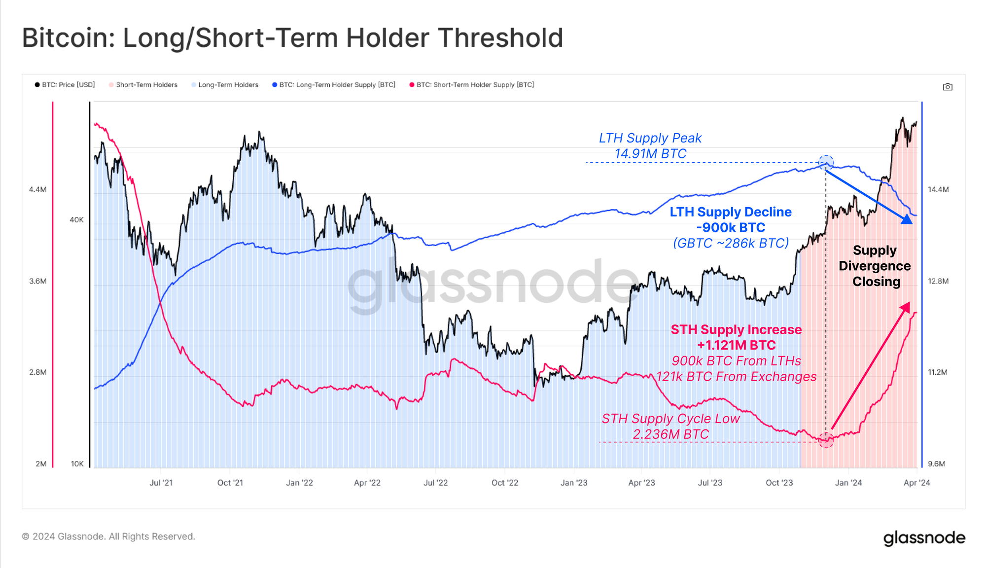
Following a historical tightness in supply (see WoC-46-2023), the divergence between Long and Short-Term Holder supply has started closing. As prices rise, and unrealized profits held by investors increase, it entices Long-Term Holders (LTHs) to part with their holdings.
LTH Supply has declined by -900k BTC since the peak of 14.91M BTC set in Dec 2023, with the GBTC trust outflows responsible for around one third of this (approx. -286k BTC).
Conversely, the Short-Term Holder Supply has increased by +1.121M BTC, absorbing the LTH distribution pressure, as well as acquiring an additional 121k BTC from the secondary market via exchanges.
Note: LTH and STH Supply are displayed here on separate y-axes for ease of visualisation.
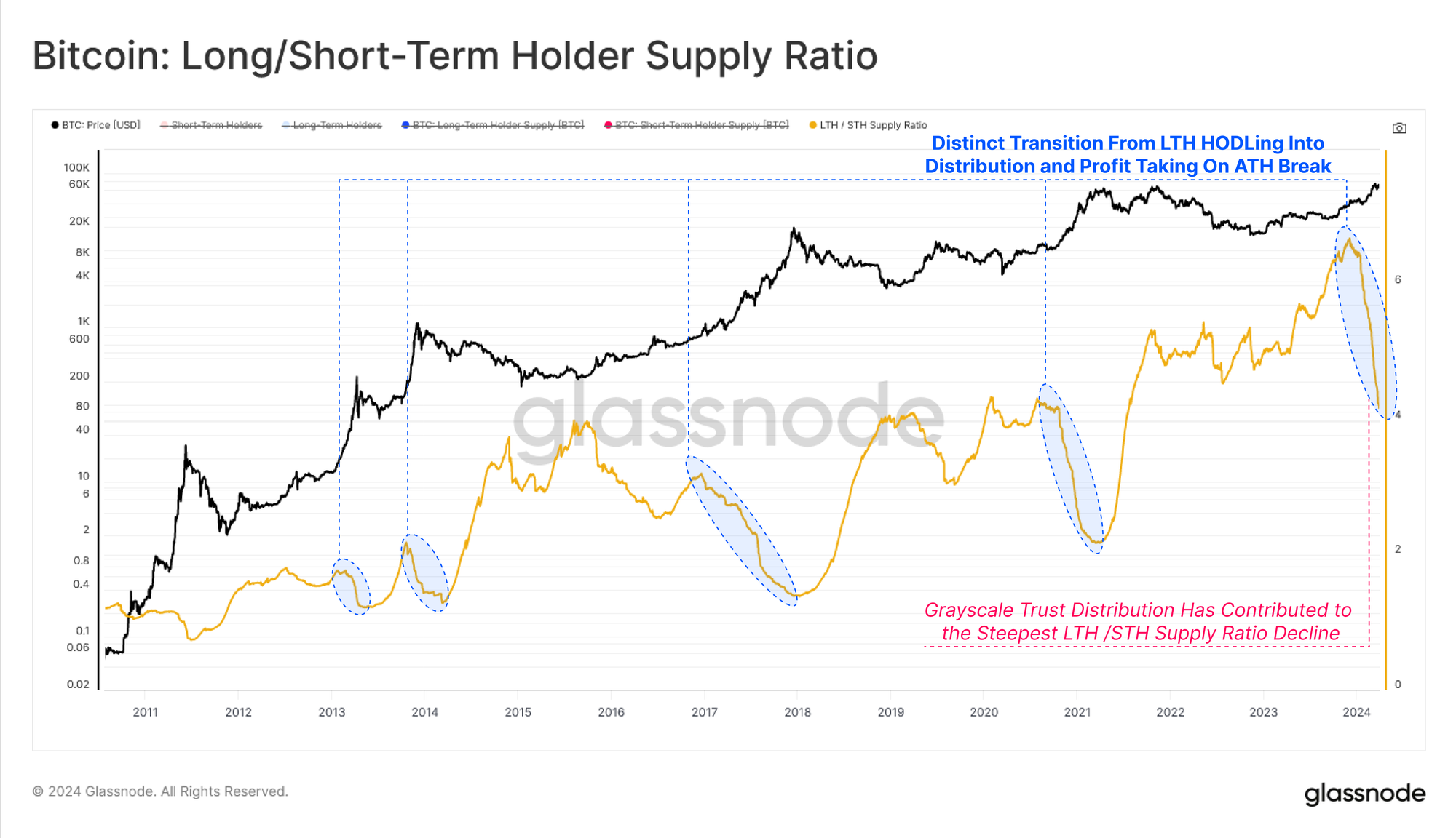
We can supplement this observation by assessing the ratio between the Long and Short-Term Holder supply. Once more, a pronounced decline is visible in all macro up-trends as the dominant investor behavior moves from Long-Term HODLing, towards distribution, profit taking, and speculation.
💡
Whilst the new US ETFs are an important new component of market structure, these trends are visible in on-chain data throughout all prior cycles.
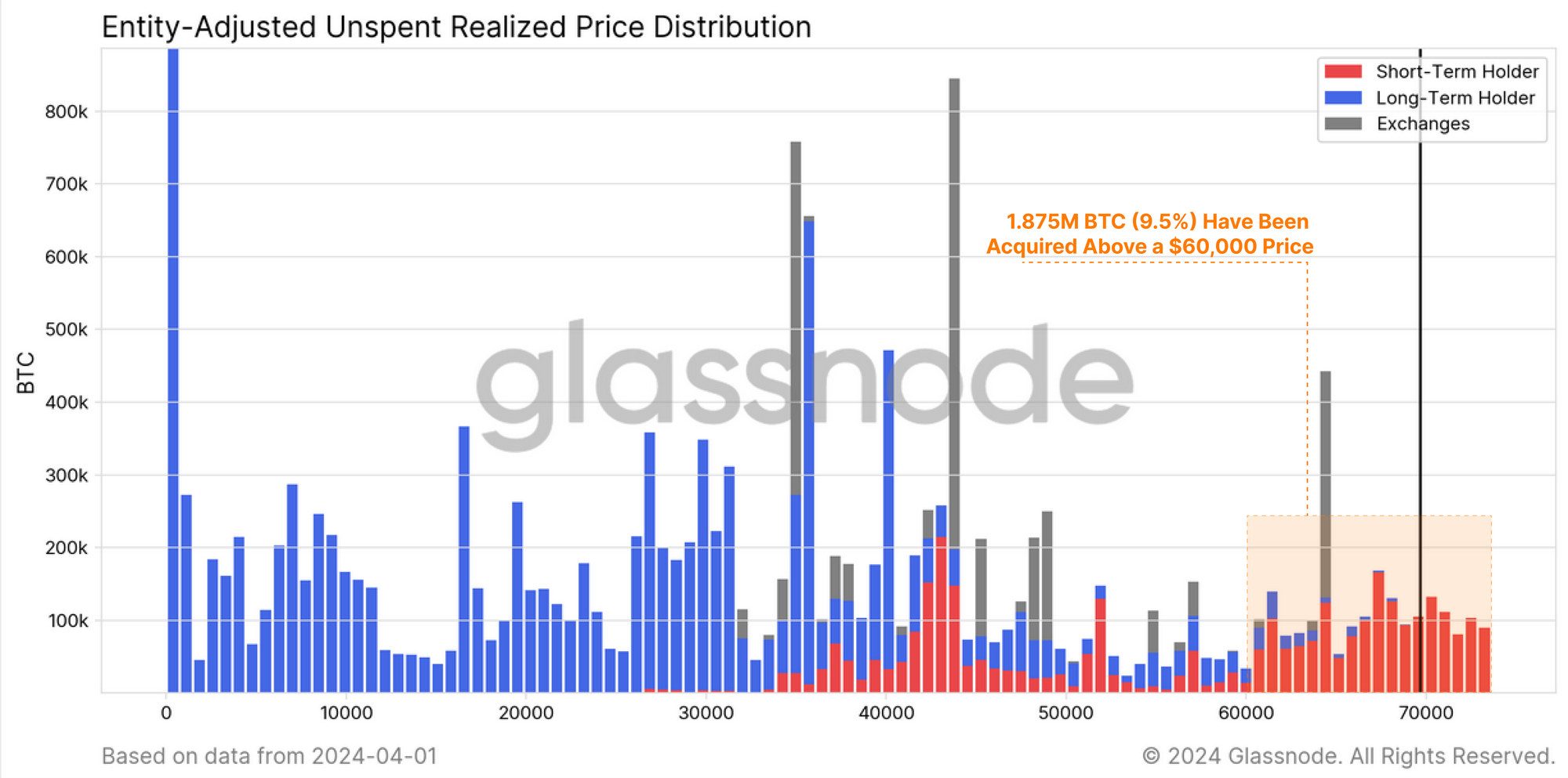
The chart below breaks down the BTC supply by on-chain cost basis, as well as by Long/Short-Term Holder cohort.
We can see that approximately 1.875M BTC (9.5% of circulating) have been acquired above $60k, with a majority designated by the Short-Term Holder cohort 🔴. This will include new spot buyers, and approximately 508k BTC now held in US Spot ETFs (excl. GBTC).
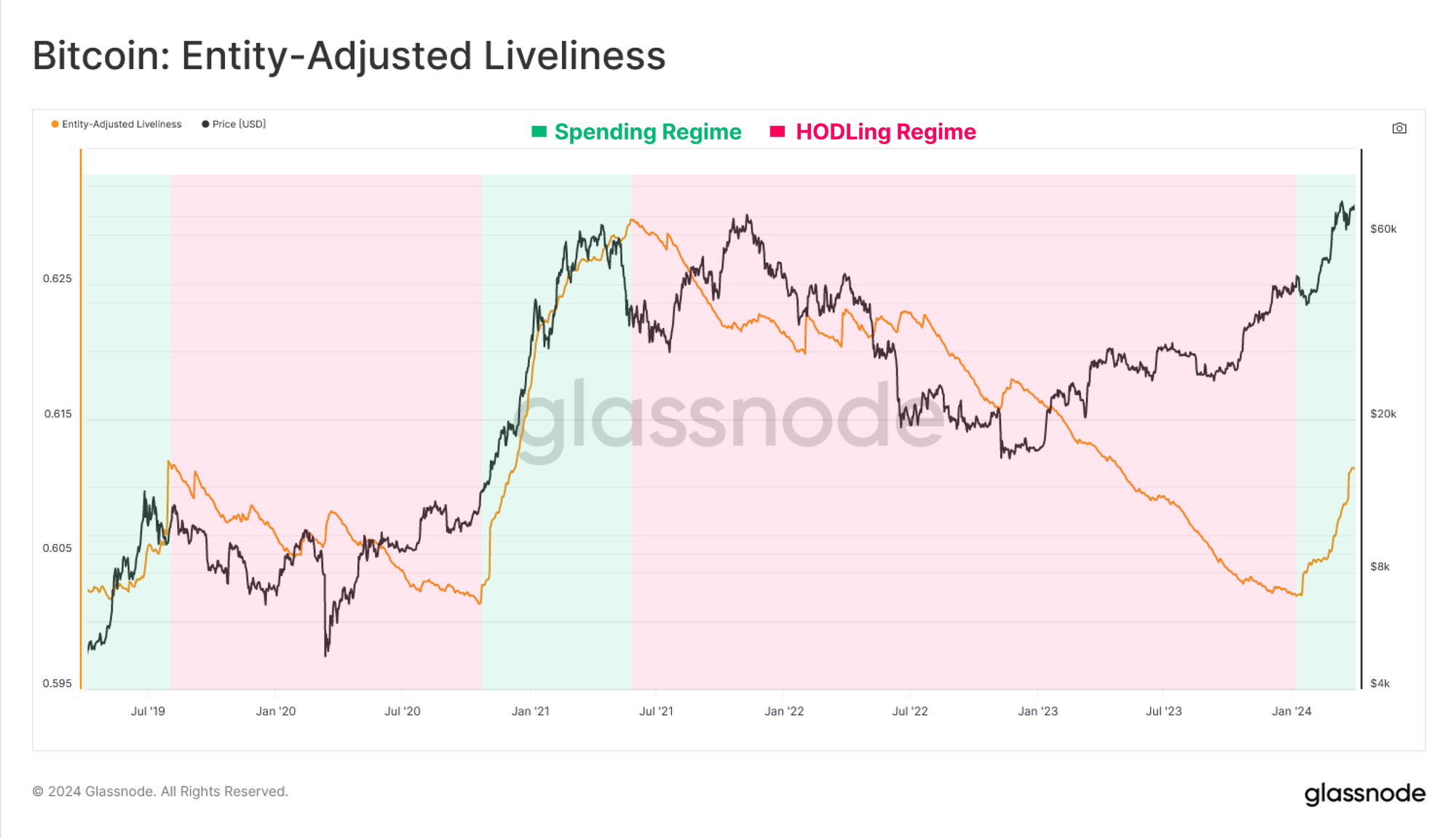
We can bolster the aforementioned observations using the Liveliness metric, which describes the aggregate balance of ‘holding time’ stored within the supply.
Liveliness is experiencing a sustained uptick which indicates that in aggregate, the expendature of long-dormant coins is outpacing the accumulation of ‘holding time’ by HODLed coins. This reiterates the thesis that the market has transitioned into a regime where spending and profit taking is now the dominant market mechanic.
Analysing markets is always seeking the balance between supply and demand, with two sides to every coin. For example, profit taking by Long-Term Holders is both a measure of sell-side pressure, but also a read on new demand inflows by Short-Term Holders.
Furthermore, with the market trading at or near new ATHs, coins which are realizing a loss, especially those from the STH cohort, are explicitly sourced from buyers who acquired near the ‘local top’.
With this as context, we can use several powerful on-chain metrics to compare the profit and loss taking events of these two key, but fundamentally opposite market cohorts (LTHs and STHs). We will use a set of three core metrics:
- Realized Profit and Loss – Being the total change in the value of spent coins from their original cost basis, to the spot price when they were moved.
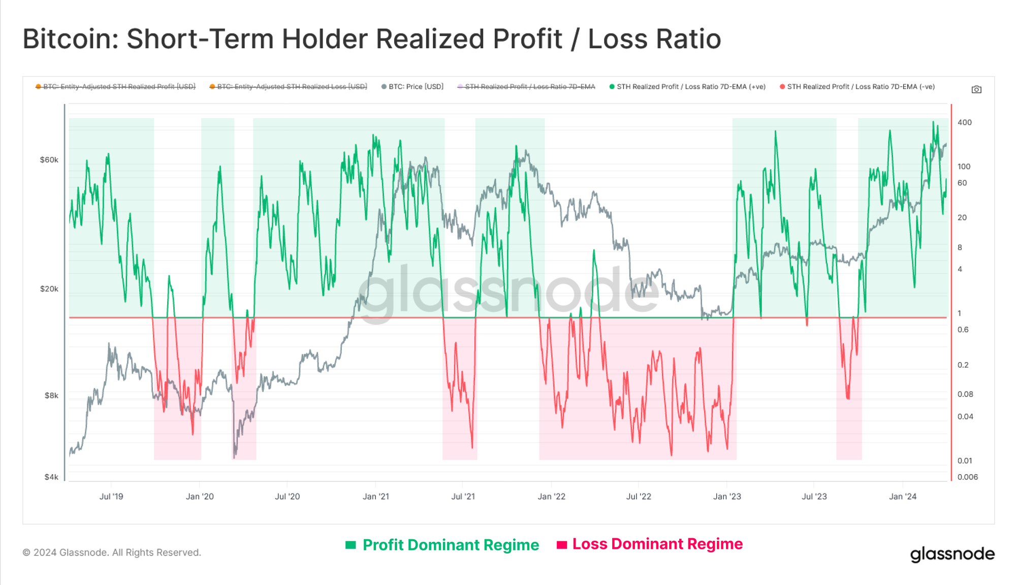
- Realized Profit/Loss Ratios – which oscillate around an equilibrium value of 1 in logarithmic scale, and is an ideal tool for spotting market inflection points. An example is where Realized Losses accelerate in an exponential manner during uptrends, increasing from ‘not much’ to ‘something meaningful’ (indicating trapped local/global top buyers are starting to panic spend).
- Sell-Side Risk Ratio – being a ratio between total Realized Profit + Realized Loss divided by the Realized Cap. In other words, this metric describes a ratio between total change in coin value (the disturbing force) and the total size of the market (the object being moved).
Starting with Short-Term Holders, we can see that their Profit / Loss ratio remains well within a profit dominated regime, with profit taking outsizing losses by 50x. Regular retests of the equilibrium level of 1.0 suggests that profits are being absorbed, and investors are generally defending their cost basis during corrections.
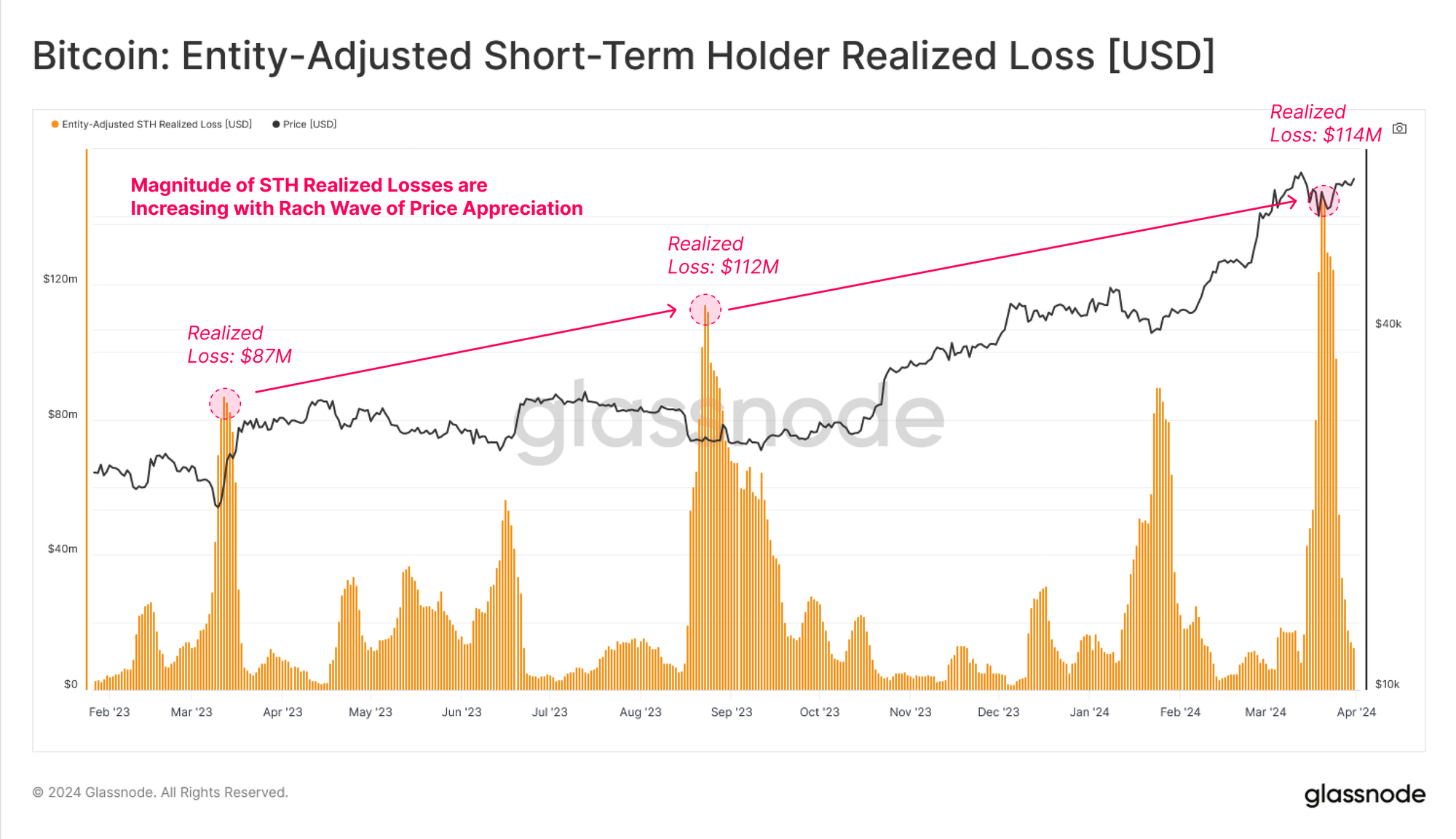
We can also see that STH Realized losses spike during dips as local top buyers panic spend on expectations the market may go lower. The magnitude of realized loss is also increasing for each successive correction, which suggests a growth in the volume and size of top buyers for each leg higher.
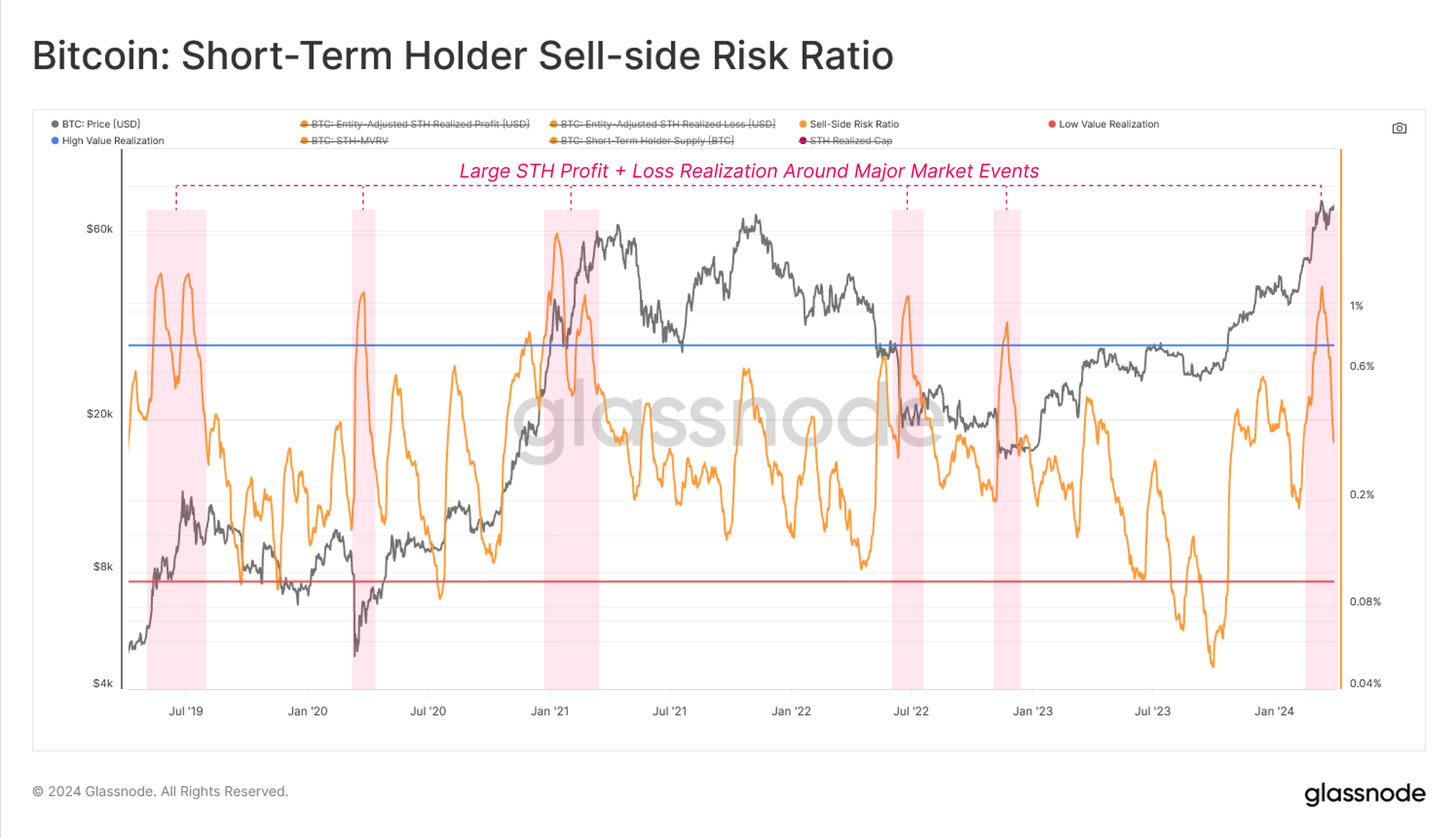
Next, we will assess the Sell-Side Risk Ratio for STHs to evaluate the relative scale of their profit or loss taking events.
- High values indicate that STHs are spending coins at a large profit or loss relative to their cost basis, and the market likely needs to re-find equilibrium (usually follows a volatile price move).
- Low values indicate that the majority of coins being spent are close to their break even cost basis, suggesting a degree of equilibrium has been reached, and an exhaustion of ‘profit and loss’ within the current price range (usually describes a low volatility environment).
Following the rally above $70k, the STH Sell-Side Risk Ratio spiked meaningfully, which typically occurs around market inflection points (global and local). This generally suggests that a new equilibrium has not yet formed, and the metric is correcting sharply as the market corrects and consolidates.
💡
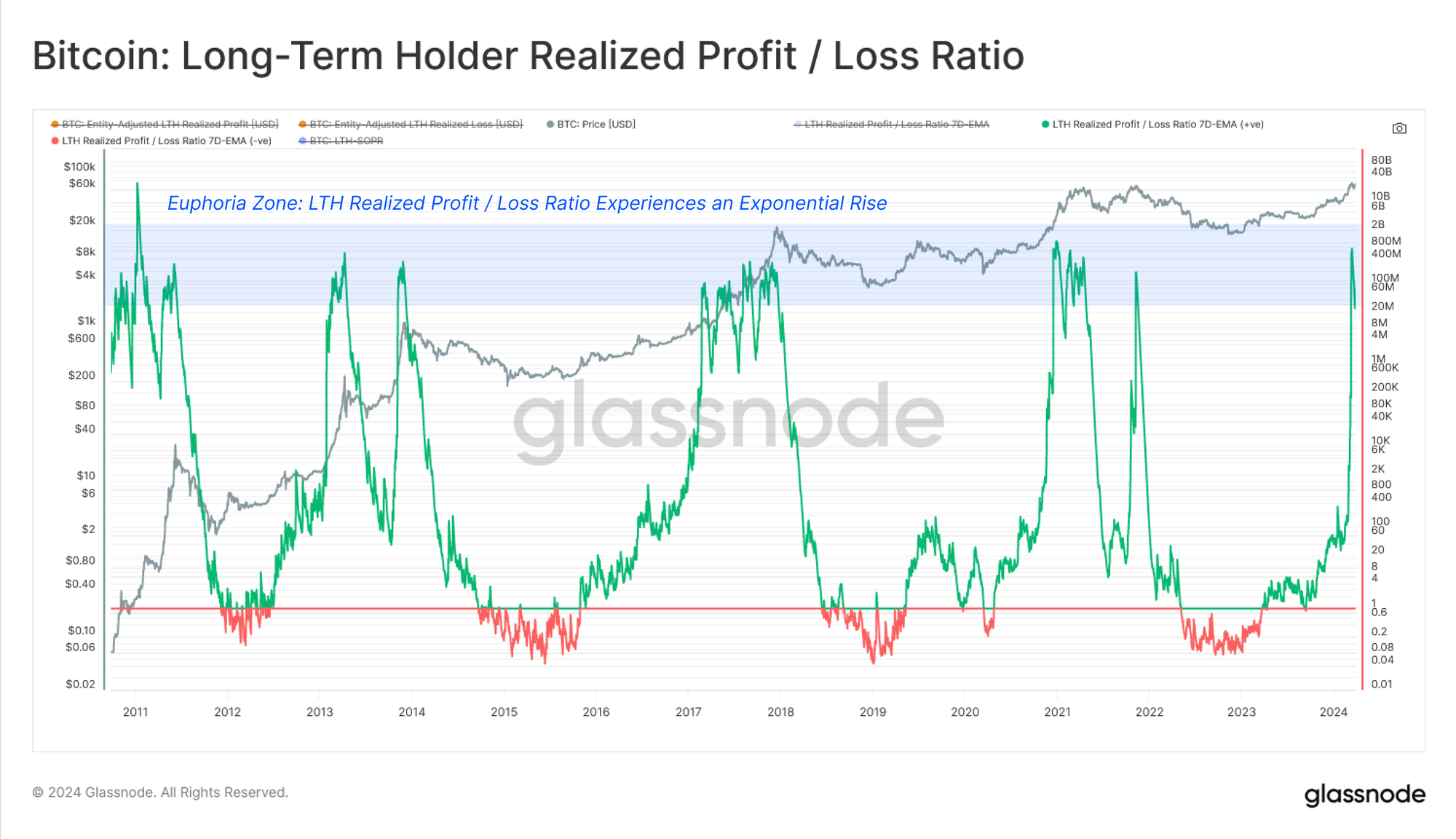
Moving onto our assessment of LTHs, we can see their Realized Profit / Loss Ratio has gone exponential and vertical. By definition, this is a result of there being no LTHs in Loss when the market has only recently broken above the last cycles ATH. This is further fuelled by the aformentioned uptick in LTH profit taking.
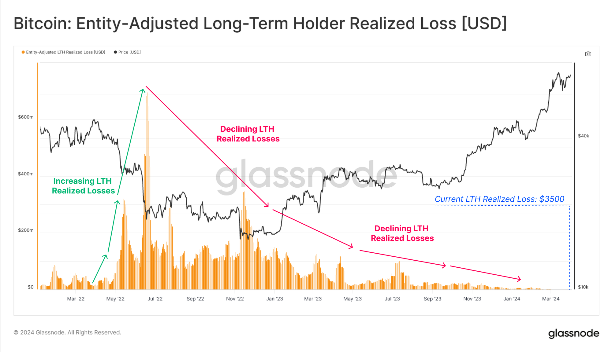
Whilst it is quite useful to track the Realized Losses of STHs during up-trends, it is more useful to monitor the Realized Profit of LTHs, as this acts as a key component of distribution pressures. To illustrate this point, we can see that LTH Realized Losses have tailed off to just $3,500 per day, compared to the $114M by STHs during the recent correction.
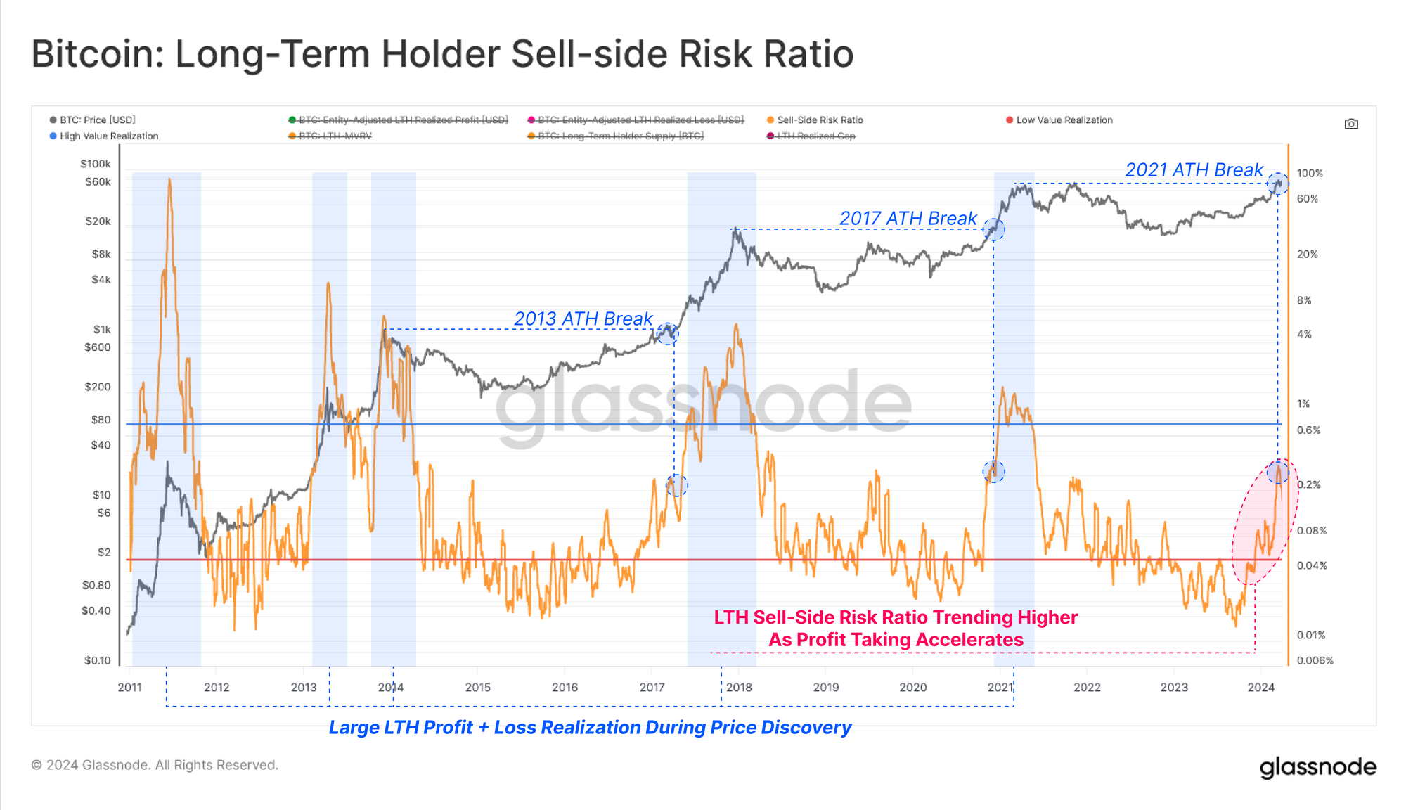
As LTH Realized Profits accelerate, their Sell-Side Risk Ratio has started to rally, particularly since October 2023. This metric is increasing well in line with historical ATH breaks suggesting that the distribution pressure and profit taking by the LTH cohort are similar to prior cycles on a relative basis.
Summary and Conclusions
Across a wide variety on-chain tools and metrics, we can see a distinct shift in investor behavior patterns. Long-Term Holders are well into their distribution cycle, realizing profits, and re-awakening dormant supply to satisfy new demand at higher prices.
Using on-chain cohorts, we can also develop a suite of tools and indicators to identify local and global inflection points, leveraging profit / loss metrics in particular. The combination of LTH and STH cohorts, alongside their profit / loss taking behaviors, provides a relatively unprecedented look into investor psychology, sentiment, and capital flows.
Disclaimer: This report does not provide any investment advice. All data is provided for information and educational purposes only. No investment decision shall be based on the information provided here and you are solely responsible for your own investment decisions.
Exchange balances presented are derived from Glassnode’s comprehensive database of address labels, which are amassed through both officially published exchange information and proprietary clustering algorithms. While we strive to ensure the utmost accuracy in representing exchange balances, it is important to note that these figures might not always encapsulate the entirety of an exchange’s reserves, particularly when exchanges refrain from disclosing their official addresses. We urge users to exercise caution and discretion when utilizing these metrics. Glassnode shall not be held responsible for any discrepancies or potential inaccuracies. Please read our Transparency Notice when using exchange data.

- SEO Powered Content & PR Distribution. Get Amplified Today.
- PlatoData.Network Vertical Generative Ai. Empower Yourself. Access Here.
- PlatoAiStream. Web3 Intelligence. Knowledge Amplified. Access Here.
- PlatoESG. Carbon, CleanTech, Energy, Environment, Solar, Waste Management. Access Here.
- PlatoHealth. Biotech and Clinical Trials Intelligence. Access Here.
- Source: https://insights.glassnode.com/the-week-onchain-week-14-2024/
- :has
- :is
- :not
- :where
- $3
- 1
- 14
- 2000
- 2023
- 29
- 500
- 9
- a
- above
- absorbed
- abundance
- accelerate
- accelerating
- accumulation
- accuracy
- acquired
- acquiring
- across
- Action
- acts
- Additional
- address
- addresses
- advice
- age
- aged
- aggregate
- algorithms
- All
- alongside
- also
- always
- amassed
- an
- Analysts
- and
- any
- appetite
- approximately
- ARE
- around
- AS
- assess
- Assessing
- assessment
- asset
- asset class
- At
- ATH
- back
- Balance
- balances
- based
- basis
- BE
- been
- behavior
- behaviors
- being
- below
- between
- Bitcoin
- Bitcoin Cycles
- bolster
- both
- Break
- breaks
- Broke
- Broken
- BTC
- but
- buyers
- by
- CAN
- cap
- capital
- caution
- change
- characteristic
- Chart
- Chips
- circulating
- class
- Close
- closing
- clustering
- Cohort
- Coin
- Coins
- combination
- come
- compare
- compared
- component
- comprehensive
- Consider
- Consolidates
- context
- continues
- Core
- Corrections
- Cost
- cost basis
- covered
- Current
- cycle
- cycles
- data
- Database
- day
- dec
- decision
- decisions
- Decline
- Defending
- definition
- Degree
- Demand
- Denominated
- Derived
- describes
- designated
- develop
- direct
- Disclosing
- discovery
- discretion
- displayed
- distinct
- distribution
- Divergence
- divided
- does
- Dominance
- dominant
- Dominate
- dominated
- doubled
- down
- during
- each
- Early
- ease
- educational
- elevated
- Engine
- ensure
- entirety
- Environment
- Equilibrium
- especially
- ETFs
- evaluate
- Even
- events
- Every
- example
- exceeding
- exchange
- Exchanges
- Exercise
- expectations
- experiencing
- explicitly
- exponential
- expressed
- Figures
- flow
- Flows
- follows
- For
- Force
- formed
- fresh
- from
- fundamentally
- further
- GBTC
- generally
- Glassnode
- Global
- Go
- gone
- Growth
- Hands
- Have
- Held
- here
- High
- higher
- historical
- HODL
- HODLING
- holder
- holders
- Holdings
- However
- HTTPS
- ideal
- identify
- illustrate
- implied
- important
- in
- In other
- include
- Increase
- increased
- increasing
- increasingly
- indicate
- indicates
- indicating
- Indicators
- Inflection
- inflows
- information
- into
- investment
- investor
- Investors
- IT
- just
- Key
- Labels
- large
- Last
- less
- Level
- leveraging
- likely
- Line
- Liquidity
- liveliness
- local
- Long
- long-term
- long-term holders
- Look
- loss
- losses
- Low
- lower
- Macro
- Majority
- manner
- March
- marked
- Market
- Market Structure
- Markets
- May..
- measure
- metric
- Metrics
- might
- Monitor
- months
- more
- motivated
- move
- moved
- moves
- Near
- nearly
- needs
- network
- New
- New Market
- newer
- no
- note
- Notice..
- now
- object
- observation
- october
- of
- off
- official
- Officially
- Old
- on
- On-Chain
- on-chain data
- once
- ONE
- only
- onto
- opposite
- Options
- or
- original
- Other
- our
- outflows
- over
- overall
- own
- owned
- owning
- Panic
- part
- particular
- particularly
- patterns
- Peak
- per
- phase
- plato
- Plato Data Intelligence
- PlatoData
- Point
- points
- potential
- powerful
- presented
- pressure
- pressures
- previous
- price
- PRICE ACTION
- Prices
- Prior
- Profit
- profits
- pronounced
- proprietary
- provide
- provided
- provides
- providing
- Psychology
- published
- purposes
- quite
- rally
- range
- Rate
- Rates
- ratio
- reached
- Read
- realized
- realizing
- recent
- recently
- regime
- regular
- relative
- relatively
- remains
- report
- representing
- reserves
- responsible
- result
- Results
- Rise
- rising
- Risk
- satisfy
- Scale
- secondary
- Secondary Market
- see
- seeing
- seeking
- sentiment
- separate
- set
- several
- sharp
- shift
- SHIFTING
- short-term
- Short-term holder
- Sides
- significant
- similar
- since
- Size
- solely
- sourced
- speculation
- spend
- Spending
- spent
- spike
- Spot
- spotting
- started
- Starting
- stored
- strive
- structure
- Suggests
- suite
- SUMMARY
- supplement
- supply
- Supply and Demand
- table
- Take
- taking
- tend
- tends
- than
- that
- The
- the information
- their
- There.
- These
- thesis
- they
- Third
- this
- those
- three
- Through
- throughout
- Tide
- to
- tool
- tools
- top
- Total
- towards
- track
- Tracking
- Trading
- transfer
- transition
- transitioned
- Transparency
- trapped
- Trends
- triggering
- Trust
- two
- typical
- typically
- unprecedented
- us
- USD
- use
- useful
- users
- using
- usually
- Utilizing
- utmost
- value
- variety
- various
- vertical
- via
- visible
- volatile
- Volatility
- volume
- Wave
- we
- Wealth
- week
- WELL
- were
- when
- which
- while
- WHO
- wide
- will
- with
- within
- words
- yet
- You
- Younger
- Your
- zephyrnet

